

A home can possess costly Italian marble floors, imported veneer wall paneling, and bespoke designer furniture, yet still feel curiously hollow, uninviting, or cluttered. When an interior space fails to evoke a sense of calm and effortless luxury, the issue is rarely a shortage of budget.
In nine out of ten cases, the flaw lies in subtle spatial miscalculations. Interior design is an exact architectural discipline combining human ergonomics, light physics, and visual proportions. When these invisible rules are disregarded in favor of disconnected showroom purchases, rooms end up fighting against their occupants.
The Foundational Principle of Interior Balance
"Interior design is not the art of dressing an empty room; it is the discipline of choreographing how daylight, scale, and human bodies move through space." Great interiors are composed with restraint, allowing materials and silence to breathe together.
1. Relying on Single-Source, Cool-White Overhead Lighting
Perhaps the most pervasive blunder in residential interiors across North India is the indiscriminate flood of cool-white (6500K) LED downlights across every ceiling grid. This clinical illumination flattens surfaces, exaggerates shadows under cheekbones and furniture, and destroys intimate ambiance.
A thoughtfully executed interior relies on three distinct lighting layers working in concert:
- Ambient Layer: Soft, indirect architectural illumination such as concealed linear warm coves or dimmable diffused surface downlights (3000K–3500K).
- Task Layer: Focused, glare-shielded lighting directed at work zones — under-cabinet counters in modular kitchens, adjustable reading sconces by headboards, or study desk lamps (4000K neutral light).
- Accent Layer: Precise narrow-beam spotlights (15° to 24° beam angles) washing textured stonework, highlighting art pieces, or framing bespoke joinery niches.
2. Misjudging Furniture Proportions and Visual Weight
Furniture pieces cannot be evaluated in isolation within expansive retail showrooms with 15-foot ceilings. What looks sleek on a showroom floor often completely overwhelms a 14x16 foot residential living room, suffocating circulation walkways.
Conversely, placing dainty, fragile-legged seating in an expansive double-height living lounge makes the room feel cavernous and deserted. You must evaluate visual mass alongside dimensional footprints:
- Heavy Foundation Pieces: Deep sectional sofas with skirts or plinth bases anchor central zones.
- Airy Counterbalances: Accompany solid sofas with slender-framed armchairs elevated on turned timber or metal legs to allow sightlines and light to pass beneath.
- Passage Clearances: Always preserve a minimum of 36 inches (90 cm) for primary walkway paths and 18 inches (45 cm) between a sofa edge and the coffee table.
3. Falling Into the "Floating Rug" Trap
A postage-stamp-sized area rug dropped haphazardly beneath a coffee table without contacting the surrounding seating is one of the quickest ways to visually shrink a room. It divides the floor plane into disjointed bands and looks like an afterthought.
Area rugs establish boundary thresholds for conversation zones. As an architectural benchmark:
- The Front-Leg Rule: At minimum, the front two legs of every sofa, loveseat, and accent chair in the seating group must sit firmly on the carpet.
- The Full Envelope: In formal lounges, all four legs of every seating item should rest on the rug with at least 8 to 12 inches of perimeter rug margin extending behind them.
- Dining Proportion: A dining rug must extend at least 24 to 30 inches beyond the edge of the tabletop so chair legs remain on the carpet even when fully pulled back for seating.
4. Pushing Every Piece of Furniture Flush Against the Walls
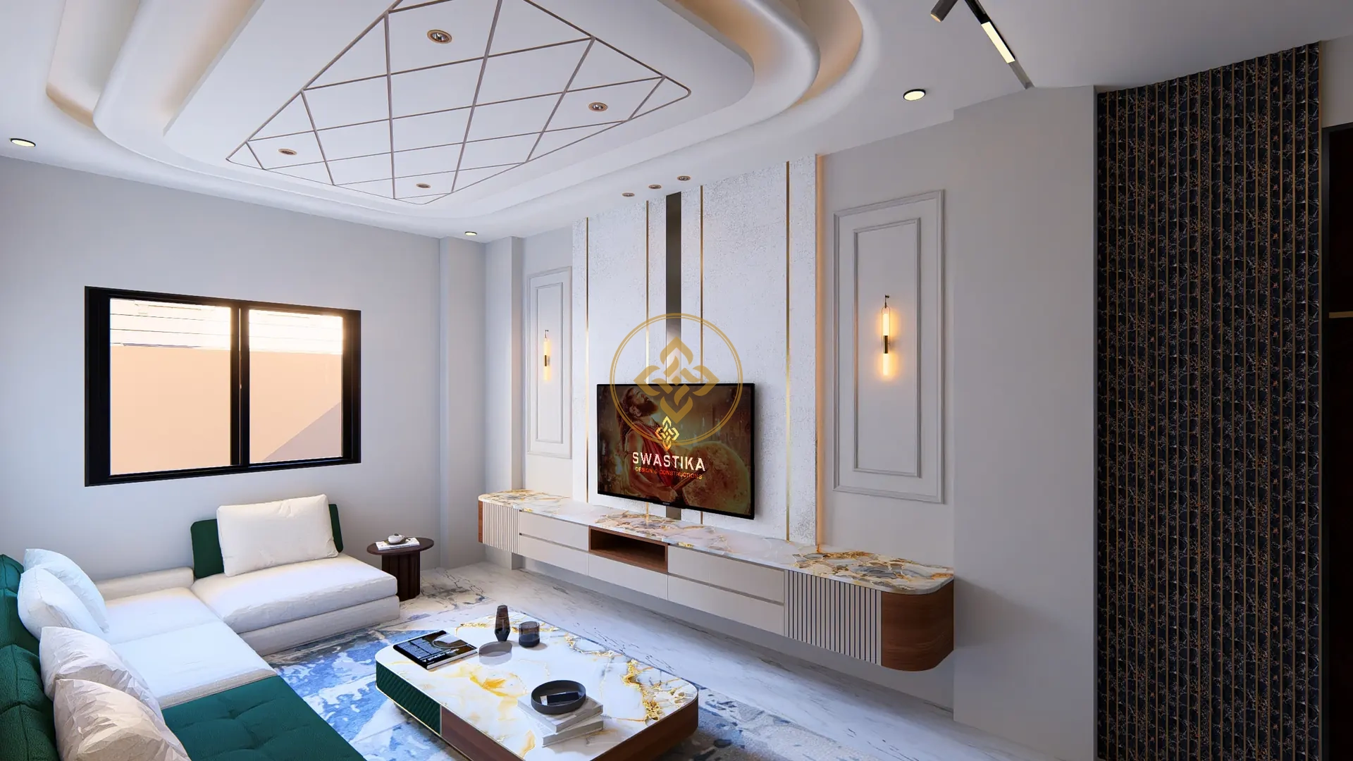
When arranging furniture without architectural drawings, homeowners instinctively push sofas, credenzas, and armchairs flat against the perimeter walls in an attempt to "open up" the floor.
Paradoxically, this produces a sterile, waiting-room atmosphere with a vacant dead zone in the center. Pulling seating just 6 to 12 inches away from perimeter walls creates shadow lines, introduces breathing room, and shifts attention toward intimate conversation clusters. In larger spaces, floating the sofa with a slender console table behind it elevates the entire spatial hierarchy.
“Simplicity is not about having less. It is about making room for what truly matters — light, shadow, texture, and the unhurried cadence of living.”
— Ankur Pratap Singh, Principal Designer5. Neglecting Negative Space and Visual Rest Stops
Every blank wall does not require a shelf, every corner does not demand an oversized planter, and every tabletop does not need an arrangement of decorative trays. In interior architecture, negative space is an active design element, not an omission.
Without quiet, unadorned surfaces, the human eye has no place to rest. When too many contrasting elements clamor for attention simultaneously — heavy textured wallpapers, fluted panels, brass inlays, and patterned fabrics — the result is mental fatigue. Give your hero architectural elements room to breathe.
6. Material Clashing vs. Monochromatic Sterility
Decorators often swing between two extremes: either purchasing an entire matching showroom suite where every wood finish is identical mahogany, or throwing together conflicting high-gloss laminates, raw rustic timbers, polished brass, and industrial black steel in a single space.
True sophistication is found in a disciplined material palette of three to four tones:
- The Base Note (60%): Neutral lime plaster, warm micro-cement, or matte off-white walls providing a quiet envelope.
- The Secondary Note (30%): Architectural woodwork such as natural white oak or warm walnut alongside honed natural stones.
- The Accent Note (10%): Tactile linen upholstery, fluted art glass, or patinated dark bronze hardware creating deliberate focal punctuation.
7. Hanging Wall Art and Mirrors at Inconvenient Heights
A frequent visual distraction is wall art positioned too close to the ceiling cornices or floating aimlessly above furniture pieces without an anchor.
Follow the global museum curator benchmark: the horizontal midpoint of any standalone painting or framed print should hang at 57 to 60 inches (145 to 152 cm) from the finished floor, representing average human eye level.
When positioning artwork above a sofa or credenza, ensure the bottom edge of the frame sits roughly 6 to 10 inches above the furniture backrest, so the art visually links to the seating unit rather than drifting away into open wall space.
8. Over-Complicated, Multi-Tiered False Ceilings
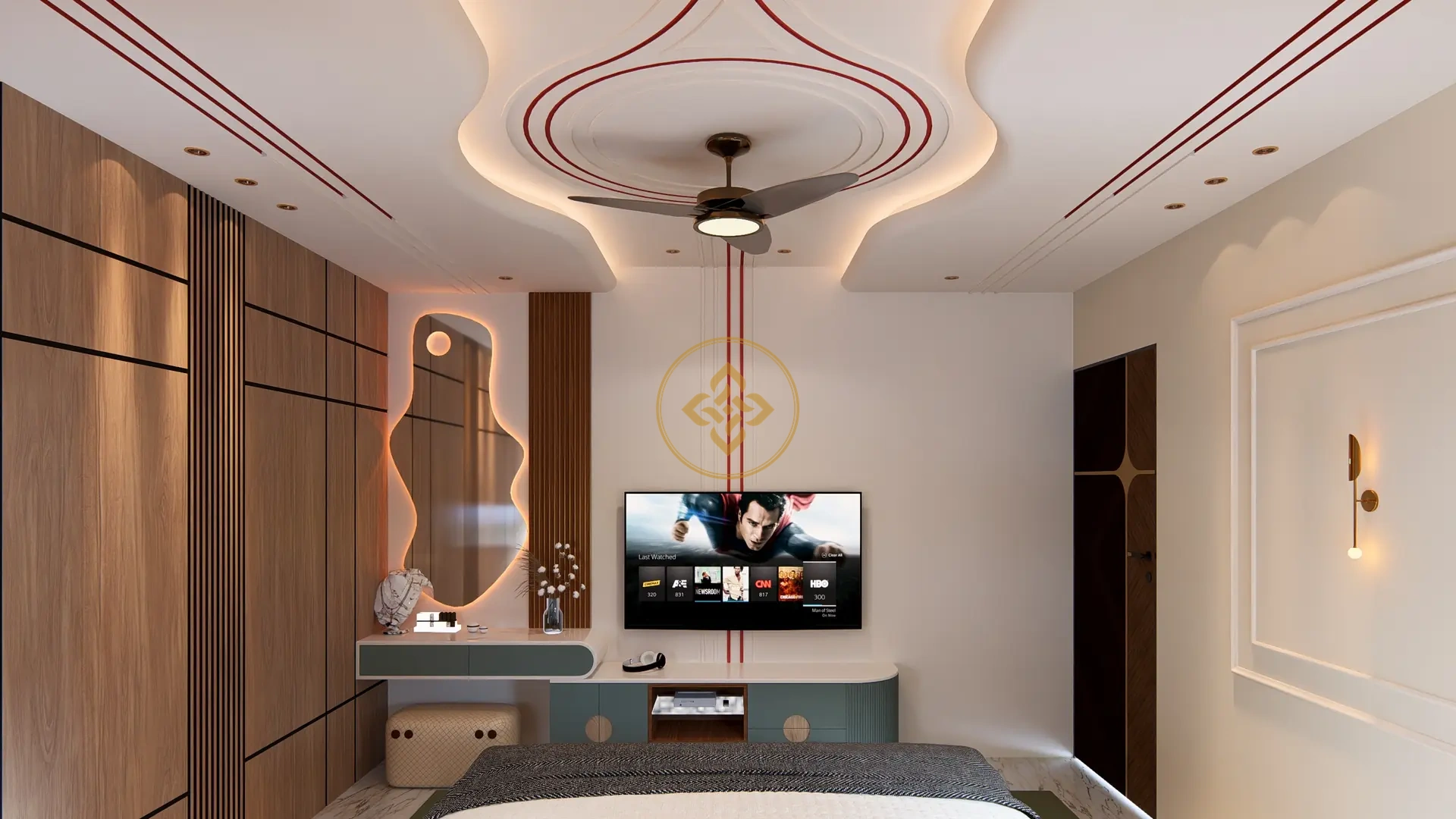
In recent years, standard residential interiors have been dominated by stepped gypsum false ceilings featuring wavy geometry, garish multi-colored RGB strip lights, and complex concentric boxes.
These heavy drops consume precious vertical volume, lower ceiling heights, create permanent dust traps in Indian climatic conditions, and quickly look dated. A refined architectural interior treats the ceiling with restraint: flush planes, minimal edge reveal details (shadow gaps), and concealed magnetic tracks that conceal light fixtures rather than calling attention to gypsum steps.
9. Prioritizing Pinterest Trends Over Concealed Utility and Storage
Open shelving looks magnificent in staged architectural photography where five ceramic bowls and one curated art monograph sit undisturbed. In daily family life, however, open display surfaces inevitably accumulate utility items, documents, charging cables, and everyday paraphernalia, transforming curated spaces into visual clutter.
Ergonomic interior architecture always balances:
- 70% Concealed Storage: Full-height built-in wardrobes, flush pantry millwork, and deep soft-closing drawers concealed behind architectural panels.
- 30% Curated Display: Intentional, recessed, warm-lit niches reserved exclusively for meaningful sculptural objects and art pieces.
10. Choosing Paint Shades Under Retail Lighting Instead of In-Situ
Selecting an interior wall color from a tiny 2-inch paper swatch underneath the bright fluorescent tubes of a paint showroom is a guaranteed recipe for disappointment. Color is entirely relative to the orientation and light temperature of the actual room.
A shade of grey with subtle blue undertones may look crisp in a north-facing studio, but will read as cold and uninviting under harsh western afternoon sun. Always demand 1x1 meter paint swatches sampled on adjacent room walls. Observe how the tone behaves across three distinct times of day: morning dawn, intense afternoon daylight, and evening artificial lamp illumination.
11. Interior Mistake vs. Architectural Solution Matrix
Examine how standard decorative missteps compare against an architecturally integrated studio methodology:
| Design Element | Common Decorative Blunder | SDNC Architectural Solution |
|---|---|---|
| Illumination | Single grid of 6500K cool-white ceiling downlights | Warm 3000K layered scheme: ambient cove, task lights & narrow accent spots |
| Floor Anchoring | Tiny floating rug beneath only the coffee table | Generous area rug with front legs of all seating firmly seated |
| Room Ceilings | Wavy multi-level stepped drops with colored LEDs | Flush architectural gypsum ceilings with concealed shadow gaps and linear tracks |
| Furniture Flow | All seating pushed flat against the outer perimeter | Floating conversation islands maintaining 36" primary circulation aisles |
| Storage Approach | Excessive open shelving collecting daily clutter | Concealed floor-to-ceiling millwork with integrated push-to-open latches |
12. Frequently Asked Questions
Relying solely on harsh, cool-white overhead downlights (6500K). This creates clinical shadows, washes out tactile textures, and causes eye strain. Balanced spaces combine ambient, task, and accent lighting at warm-to-neutral temperatures (3000K to 4000K).
Avoid the floating rug trap where only the coffee table sits on the carpet. At minimum, the front two legs of every primary seating element (sofas and armchairs) should rest firmly on the rug to visually anchor the conversation island.
Perimeter-only layouts expose dead, unusable space in the center of the room and draw attention to room boundaries. Floating key seating elements creates intimate conversational groupings, smoother traffic circulation, and greater spatial depth.
Art is frequently hung too high. The universal museum standard is centering the midpoint of the artwork at eye level — approximately 57 to 60 inches (145 to 152 cm) from the finished floor level.
No. Over-designed, stepped false ceilings with excessive cove lights reduce vertical clearance and gather dust. Modern architectural interiors favor clean perimeter soffits or flush gypsum ceilings with concealed linear magnetic tracks.